Although the bulk of my experience in this area comes from managing legal texts on small product labels, I am no stranger to layouts you could find in magazines or books. Most of the actual work I've done in this category cannot be posted here, but what I can post is a particular academic project which I think showcases my capacity in this area rather accurately.
Humano Obsoleto
A bleak look into the future of human labor
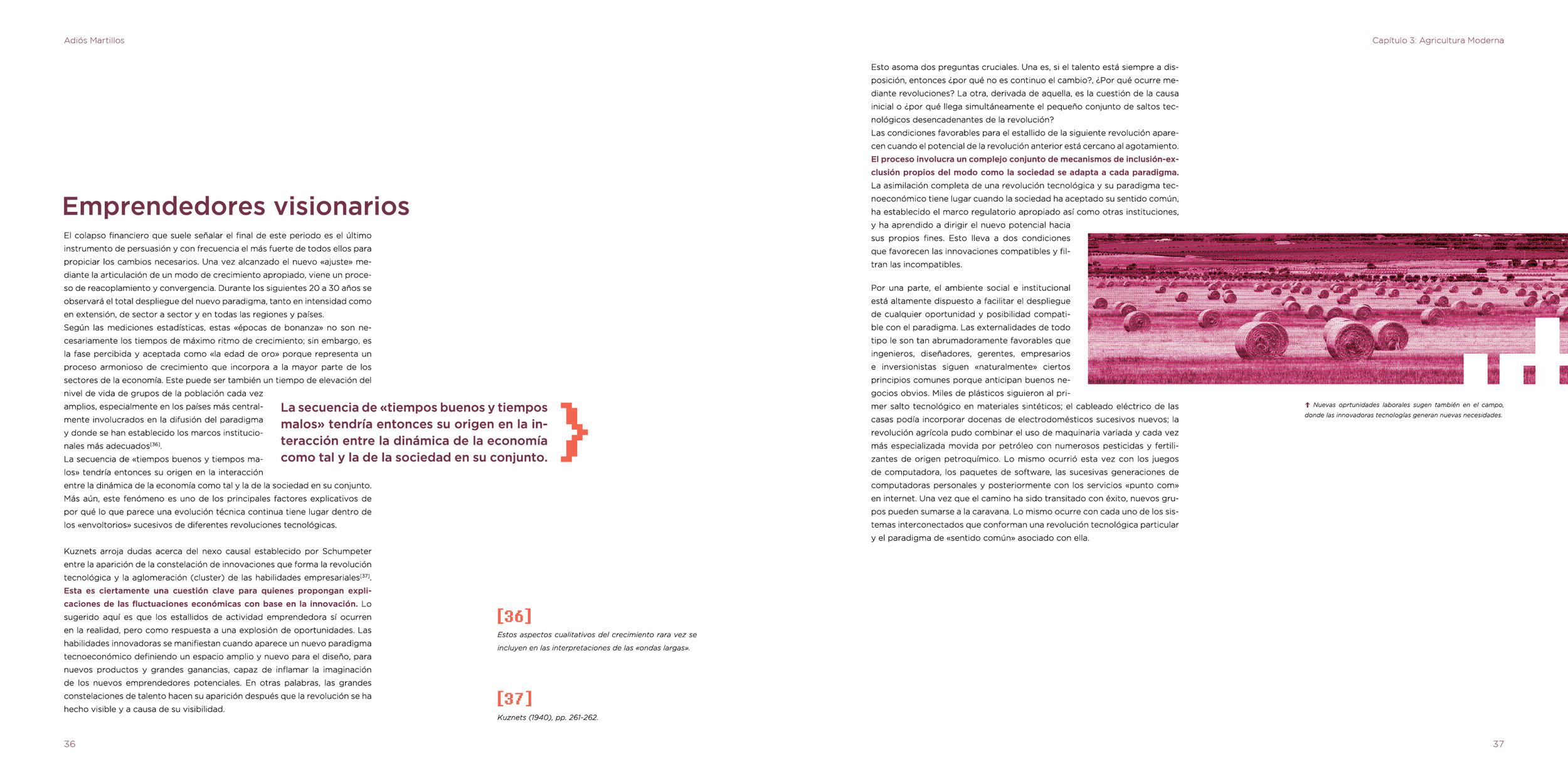
The assignment was to design the cover, opening pages and index of a 3 tome collection of books, plus the first 50 pages of the initial tome. The most important requirement was that a very defined style, complementing the tone of the chosen narrative, had to be established and consistent across the entire project.
I chose to work with the effect of automation on the future of human labor and divided the tomes into manual labor (goodbye hammers), professional labor (goodbye ties) and artistic labor (goodbye paintbrushes). I wanted the collection to have an informative appearance, but a serious tone. Like a manual that calls for reflection.
Color
Each tome is designed to use only three inks: a primary color, a secondary one, and black.
- Titles, subtitles, and highlights appear usually in the primary color.
- Images are mostly converted to duotone using the primary color and black.
- Miscellaneous elements and other details are used mainly in the secondary color.
- Base text is always black.
Typefaces
Only 3 typefaces are used in this whole project:
- Nexa Bold, for titles and subtitles
- Gotham light for the base text, with its medium variant for highlights
- Fixedsys Excelsior, for miscellaneous elements and other details.
Resources
The main resources I use to define the visual style of the whole collection are ASCII art, pixelated elements, and binary code.
- The first is most notable in the three covers, which are basically pictures I converted to ASCII sequences with a web tool and a lot of patience.
- Pixelated elements are mostly used as ornaments, but there's also a system of pixel icons that identifies each chapter of the tomes.
- Binary code is used on the endpapers, chapter covers, and other smaller instances to complement the style.
Below you can click the thumbnails to check out the spreads I designed for the first tome.
Don't mind the text tough: it's just segments from a paper on a similar topic that I spliced up arbitrarily to use as placeholder text.


