Editorial Design

Although the bulk of my experience in this area comes from managing legal texts on small product labels, I am no stranger to layouts you could find in magazines or books. Most of the actual work I've done in this category cannot be posted here, but what I can post is a particular academic project which I think showcases my capacity in this area rather accurately.
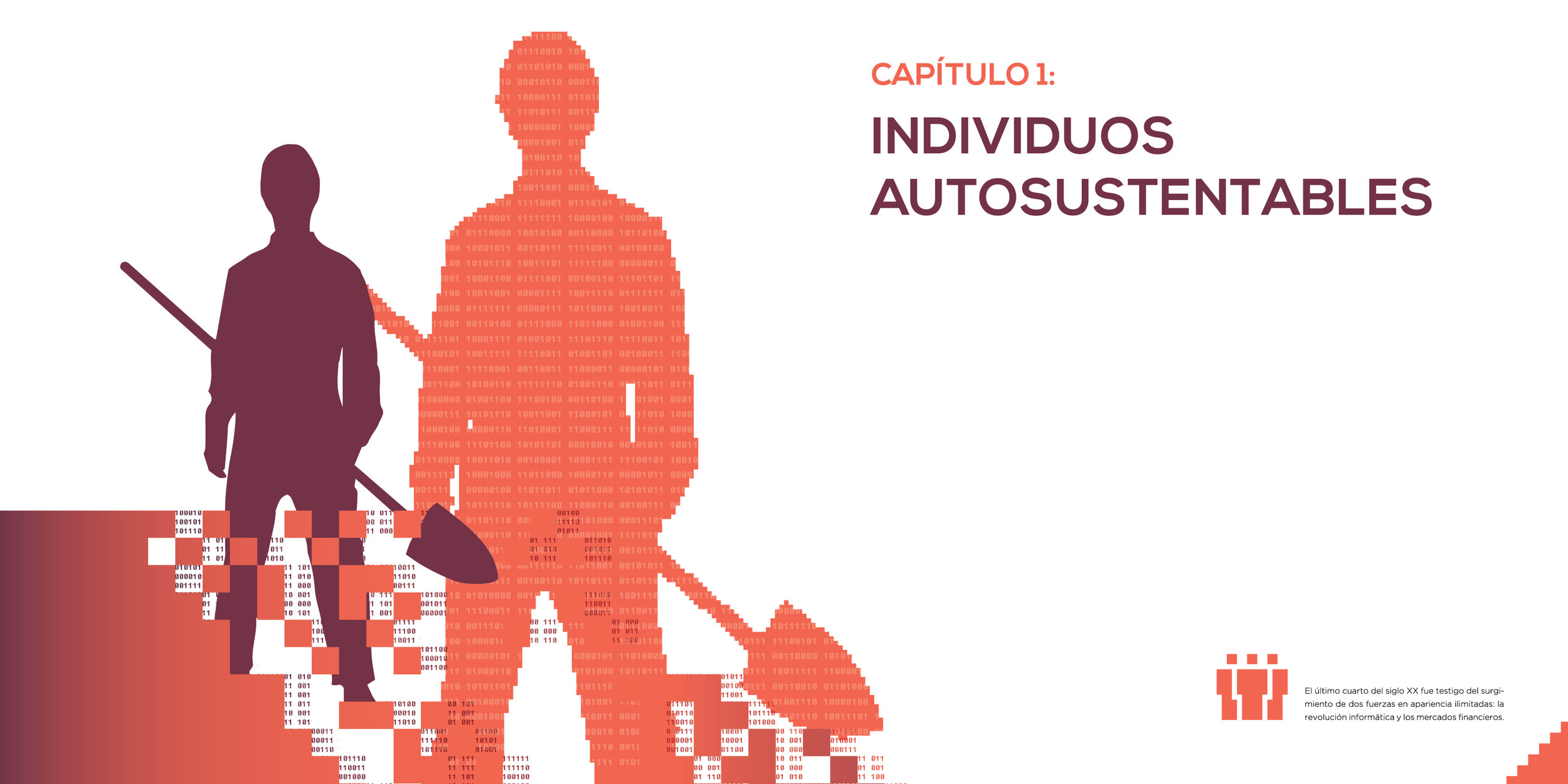
 

Humano Obsoleto

A bleak look into the future of human labor

The assignment was to design the cover, opening pages and index of a 3 tome collection of books, plus the first 50 pages of the initial tome. The most important requirement was that a very defined style, complementing the tone of the chosen narrative, had to be established and consistent across the entire project.

I chose to work with the effect of automation on the future of human labor and divided the tomes into manual labor (goodbye hammers), professional labor (goodbye ties) and artistic labor (goodbye paintbrushes). I wanted the collection to have an informative appearance, but a serious tone. Like a manual that calls for reflection.

Color
Each tome is designed to use only three inks: a primary color, a secondary one, and black.

  • Titles, subtitles, and highlights appear usually in the primary color.
  • Images are mostly converted to duotone using the primary color and black. 
  • Miscellaneous elements and other details are used mainly in the secondary color.
  • Base text is always black.

Typefaces
Only 3 typefaces are used in this whole project:

  • Nexa Bold, for titles and subtitles
  • Gotham light for the base text, with its medium variant for highlights
  • Fixedsys Excelsior, for miscellaneous elements and other details.
     

Resources
The main resources I use to define the visual style of the whole collection are ASCII art, pixelated elements, and binary code.

  • The first is most notable in the three covers, which are basically pictures I converted to ASCII sequences with a web tool and a lot of patience.
  • Pixelated elements are mostly used as ornaments, but there's also a system of pixel icons that identifies each chapter of the tomes.
  • Binary code is used on the endpapers, chapter covers, and other smaller instances to complement the style.
DSCN3362_ret.jpg

Below you can click the thumbnails to check out the spreads I designed for the first tome.
Don't mind the text tough: it's just segments from a paper on a similar topic that I spliced up arbitrarily to use as placeholder text.

Branding

Here's a series of small projects I developed by myself on my spare time. These are examples of my capacity for a hands-on approach, fluid shoulder-to-shoulder work with clients and dealing with tight deadlines.

WEMADE SOCIAL

Young and dynamic, but serious

Wemade is basically a social media management firm that was starting from scratch. The focus when creating it's brand was in making it appear both modern and young, but also in making it inspire trust and reflect professionalism.

DSC_0037.JPG

We chose sticking to a cool color palette and a sturdy typeface for the serious side of things and appealed to diagonals and overlapping planes for a stronger style. The result looks corporate for it's simplicity, but is dynamic and versatile at it's core.

Wemade slides-01.jpg


La Movida

Social work with a rythm to it

La Movida is an art and music workshop for kids and teenagers from impoverished neighborhoods that aims to promote respect and develop responsibility and teamwork. They meet weekly in Los Troncos (Partido de Tigre, Buenos Aires, Argentina) and attendance is free.
When they were starting, a friend of mine that volunteered there came to me for help developing a brand in order to get patrons and volunteers.

03 Ajuste-01.jpg
Foto Grupal La Movida RET_web.png

The team really wanted to work with the shapes of hands for the logo, as they felt it was representative of both the musical and social side of the group's effort. For the rest of  the system, we prioritized making elements colorful, playful, simple and easy to hand over for collaboration with different volunteers.

Bifold Brochure Mockup - La movida_web.jpg


CANAL GENIAL

A multi-user content platform

Work for this project began with a very crude draft by the client and a handful of references. The nature of the platform called for some consideration regarding the versatility of the logo as a kinetic element.

Outro CG Alt 03_2.gif


Flopcase

Neat, sturdy and colorful

A Flopcase is a multipurpose plastic folder. I developed its logo and some basic design guidelines back when I was in my first years of university and made some adjustments to them shortly after.

Portfolio_022.jpg

MKTPOL

Modern and easy to follow

The idea behind this enterprise is to offer marketing strategies and social media administration to a very specific set of clients.
To begin working I was given a name (MktPol) and a simple guideline: make things as clean, simple, and as easy to understand as possible.

Mkt Pol-01.jpg

The logo itself remains rather simple, and character is imbued into the brand using color and a 45º cut on specific elements. So designed pieces are to remain clean and simple.

Mktpol slide.png


Loop Sessions BA

Design that flows with the beat

The Loop Sessions are music production gatherings that take place in several cities around the world. It's a friendly space to hang out with musicians and create some neat beats in the process. Although they all build up from the same principles and collaborate amongst each other, the different city's sessions are independent and have their own identity.

I had the opportunity to help out bringing the first Loop Session to Buenos Aires. We aimed to create something new that we felt represented our vision for the project in that city and also paid homage to some of the other sessions.

Loogo-LSBA-03_1.gif
Loop sessions insta.png

Another consideration was the possibility to adapt the brand to work with different cities, for example, Toronto, since the project will shortly arrive there as well. Lastly, we hope and encourage that this identity will grow and mutate as the project itself grows.

Banner 2.jpg

Animation

Animation, in general, has been an interest of mine ever since I was a kid. I started with Flash and worked my way up to After Effects, even entering a tad into the realm of 3D. 
Video editing is another passion of mine, and I really enjoy it every time I get the chance to work on a project that involves it.
I wouldn't call myself a professional in either area, but I would say I can manage them well and would love any opportunity to expand my abilities.


Elephant alternative opening credits

This was an academic project I revisited and updated a few years after it was presented. It was one of the first things I made with After Effects, but I think it still holds up pretty well.


Martin Añón's WWISE demo reel

Marin was working on this demo and needed help creating some visually interesting backdrops for the titles and lower thirds. After a short exploration of references, we started experimenting with a couple of After Effects plugins that reacted to the sounds and music he was showcasing.
(Note: in this case, I only worked on the graphics and special effects, the filming was done by Tomás Figuredo and the editing by Martin himself).


My demo reel

The same that plays on my homepage. It showcases some of my design projects and segments of some of my animation projects. I tried to create a small scene for every project that would complement its style or concept.

Image Editing

Few things get more frustrating than having an idea and lacking the means to materialize it. In this section, I intend to showcase the variety of tools I've acquired over the years that aid me whenever I need to make concepts tangible. 


Photoshop

From making a subtle adjustment to a photo all the way to creating an entire poster from scratch, digital image editing is something I do almost daily.
Most of what I know I learned on my years working in Grupo Berro. There, I created and edited an innumerable amount of packaging mockups (mostly for internal development with SC Johnson) and made major adjustments to studio pictures of packaging and books, amongst other things.
But due to the collaborative nature of GB's work methodology, I wouldn't feel right posting any of those works as my own here. Instead, I've compiled a short gallery of academic works and personal projects you can check out below.


Analog techniques

I include this subsection here to make it clear that I'm willing to get my hands dirty if necessary. What I mean to say is that if we need to, for example, add an ink stain to a design, maybe instead of googling for one and calling it a day, it's better to get ink, make some stains, scan them, process them, and only then use them. The gallery below contains images showcasing some of the analog graphics techniques I've applied in the past.


3D Tools

I never ventured too deep into the realm of 3D Design, but I was always intrigued by the tools and techniques involved. My curiosity has driven me to learn the basics of some of the tools, and in time I found them to be a valuable resource in aiding me as a Graphic Designer. Below are a couple examples of some quick projects I worked on making use of Blender or 3D Max.

Studio work

All of my experience working in a graphic design studio comes from my 8 years at Grupo Berro. I had the opportunity to participate on countless projects, while learning from industry veterans which also happen to be excellent people. I can proudly say that both my professional formation and my work values have been forged by my time working with them, and I'd venture to say that I've managed to leave my own mark in the studio as well.

I can't point to any specific work and claim it as my own, because of both the collaborative nature of Grupo Berro and the specifics of my position within the team, but I can mention certain projects I got the chance to work in a little more closely than the rest.


S.C. Johnson

SCJ is a massive worldwide company in charge of a huge amount of products. I got to work on product labels and digital media for products under the Mr. MuscleLysoformBlem, and Glade brands, among many others.
Adjustments to front and back labels, adaptation from old to new guidelines, implementation of guidelines on new labels, and creation of digital banners for e-commerce platforms, were some of my everyday tasks working for them.
A big takeaway for me from these projects is learning the dynamics of interacting with such a big company, and doing so in both a personal and professional manner.


Cachafaz

This is a company famous for the quality standard of their products, often said to have the best alfajores in the country. Grupo Berro was in charge of the design for many of their products (including these and these) during a period, and I got the chance to participate.
For this client I did some image editing work on the great product photos that we used, some minor adjustments on certain final artworks, and editorial work for a catalog of a specific line of products, among other things.


Las Lilas

When I first started working as an intern, most of what I did was tidying up, organizing stuff and making coffee. But after some days I began working a little for Las Lilas. I didn't get to work on design, mind you, but rather I ended up doing some heavy duty data processing.
We're talking endless excel files full of numbers and attributes that had to be checked against the huge print files of the livestock catalogs. A daunting task that would have intimidated and frustrated a lot of people, but I managed to stay on top of it.
I eventually moved on from this kind of work, but in retrospect I appreciate it, for it helped in forging my methodical and efficiency-seeking character.


Molinos

This is another enormous company which Grupo Berro often works with. It never ceases to impress me hearing about a project over lunch, watching how it develops at the hands of my boss and coworkers, and then one day having it suddenly appear on billboards and supermarket aisles everywhere.
Again, my participation in most of these projects was rather limited, but the opportunity to at least presence the development of projects like Don Vicente, Cocinero, Gallo, Chocoarroz, and Lira has been rather enriching.